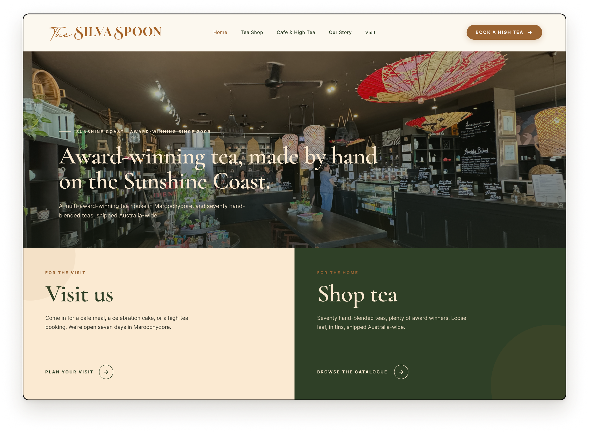
Website Redesign / UX Case Study
A website redesign for an award-winning Sunshine Coast tea house and cafe, giving its two audiences, cafe visitors and online tea shoppers, a clear path from the very first click.
Role
Team Lead, UX Designer
Duration
May – Jun 2026
Platform
Responsive Website
Tools
Figma, FigJam
The Silva Spoon is a much-loved tea house in Maroochydore with a wall of awards and seventy-plus hand-blended teas. Its website was letting both of them down.
As team lead, I guided three designers through the redesign and personally owned the homepage: the front door that has to greet two very different audiences at once. This case study walks through how we untangled that.
The redesign is still in development, with no confirmed launch date yet.
The Silva Spoon's website served two audiences, cafe visitors and online tea shoppers, but supported neither well. Cafe visitors could not book without calling, and online tea shoppers could not browse the catalogue without getting lost. A business that feels considered and warm in person felt flat and confusing online.
We interviewed people who book cafe experiences and people who buy tea online. What they told us was remarkably consistent, and one word kept coming up: exhausting.
"It took way more effort than it should have. I had to open so many tabs, compare everything, and bookings were really clunky. It honestly felt exhausting."
Naba Fatima, online tea buyer
"If I can't figure out what a place offers in a few seconds, I'm gone."
On discovery. Users expect instant clarity on what it is, what they can do, and how to act.
"If the website looks clean, clear, and detailed, I trust it more."
On trust. Confidence is built through good design, clear information, and transparent pricing, especially when paying a deposit online.
"I couldn't book online and had to keep calling, it was really frustrating."
On booking. Users want quick, self-service booking, not manual back-and-forth.
We sized up three sites against our two audiences: one direct competitor and two tea retailers to learn from.
Shingle Inn City Hall, the direct competitor
Serves both dine-in and online, with a clear top navigation and a real heritage feel. But it leans on dated carousels, and the high tea menu is a downloadable PDF, which is painful on mobile and invisible to search. We keep the warmth and make booking and menus part of the page.
T2, the brand the client admires
Confident, design-led, with photography doing the heavy lifting and clean category tiles. But it is a brand, not a place, and the loud hero feels like a fashion drop. We borrow the discipline and photography while staying classic and warm, leaning into the cafe, awards, and story T2 cannot copy.
Tea Tonic, pure e-commerce
Smart tea categories by type, format, and occasion make finding a tea easy, with gentle nudges that keep people buying. But the rainbow branding reads busy, not premium. Its category structure became our benchmark for fixing tea discovery, minus the loud styling.
Two doors, one home
Clear pathways for both audiences from the first click, without either one feeling sidelined.
Guide, don't overwhelm
Curated browsing instead of endless scrolling through a flat list of products.
Friction-free booking
Self-service in three steps or fewer, with instant confirmation and no phone tag.
Five questions turned the problem into things we could actually design for.
Three calls shaped how the whole site works.
Two paths from the homepage
From the first screen, people choose Visit us or Shop tea, so each audience is sent straight to what they came for instead of wading through the other one.
Booking that finishes online
A high tea, a table, or a cake can all be booked right on the site in a few steps, with instant confirmation. No more phone tag.
Tea sorted so people find it
The seventy-plus blends are grouped by type and tagged as bestseller, award winner, or staff pick, so a first-timer can find a tea without scrolling past all of them.
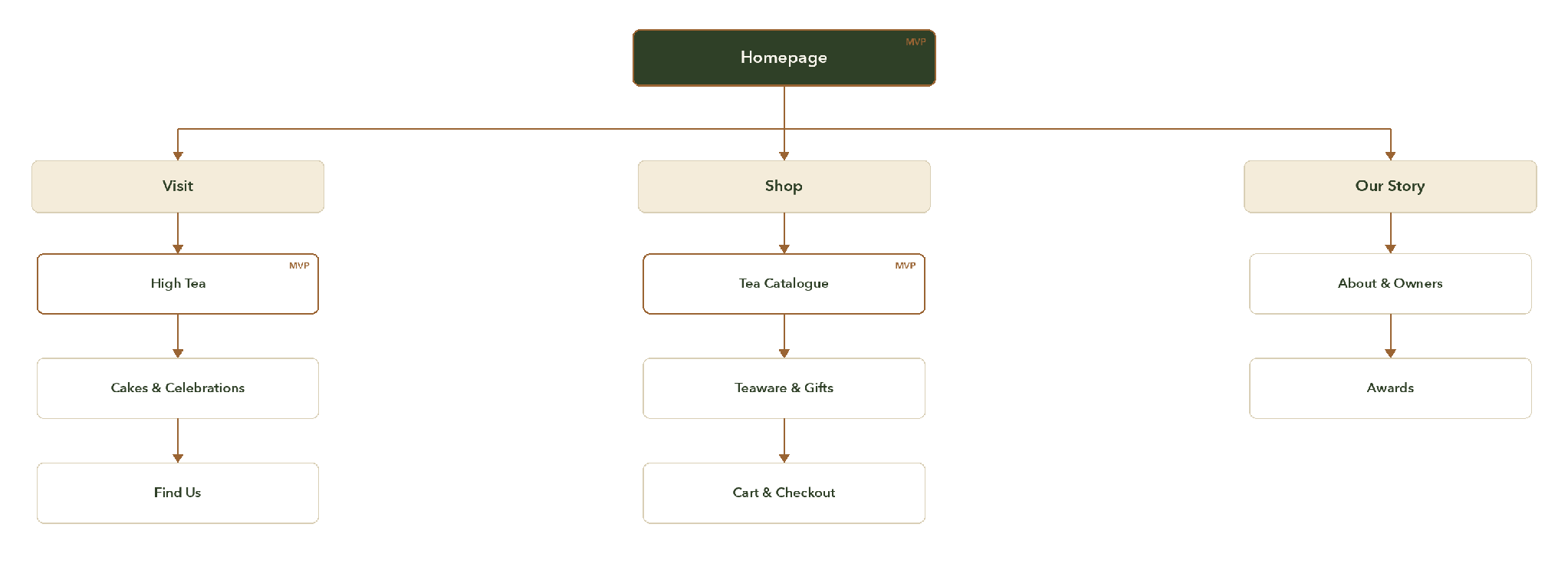
The sitemap makes the two-door strategy structural. From the homepage, everything branches into Visit, Shop, and Our Story, with the three MVP pages, homepage, high tea, and tea catalogue, marked as the build priority.
The brand already had a strong identity: logo, colours, fonts, and tea-label design. Our job was to define how those assets behave on a website and guide someone toward a booking or a purchase.
The homepage was my page to own. It carries the hardest job on the site: greet two audiences at once and send each to the right place, all while making a sixteen-year-old tea house feel as considered online as it does in person.
Below an award-winning hero, the page splits cleanly into Visit us and Shop tea. Each door has its own voice and its own call to action, so the choice is obvious within seconds of landing.
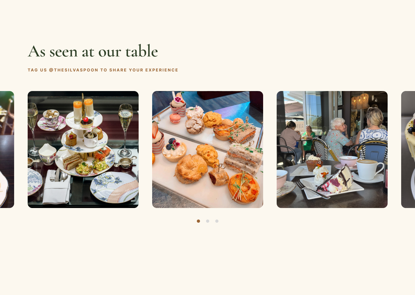
Sixteen years and a wall of awards are real trust signals, so the homepage surfaces them, but quietly: a recognition strip and an award-winning blends section that lets the credentials speak without the brand shouting.
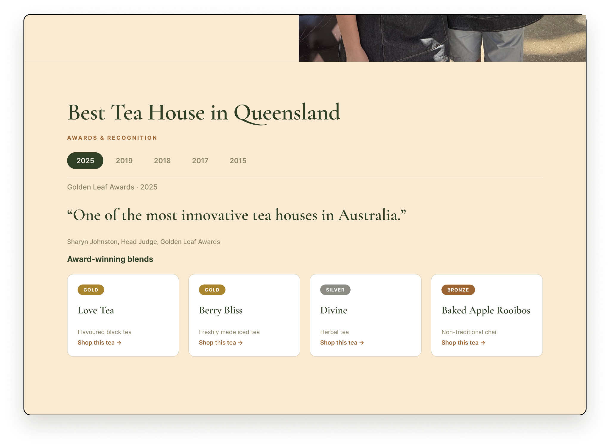
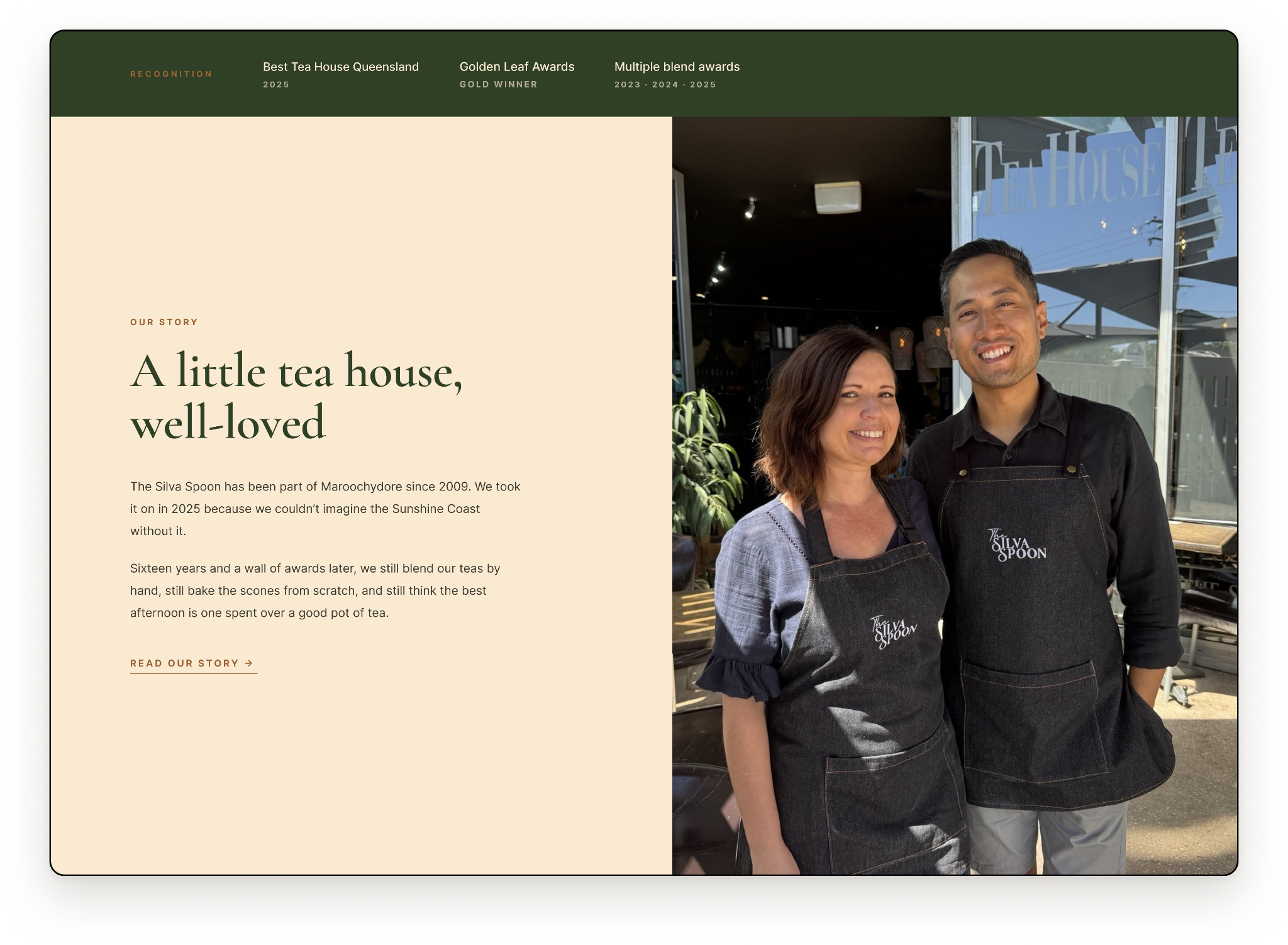
Rather than dropping visitors into seventy-plus teas, the homepage previews a curated few and offers an easy way to book a table, bridging the online and in-person experiences under one brand.
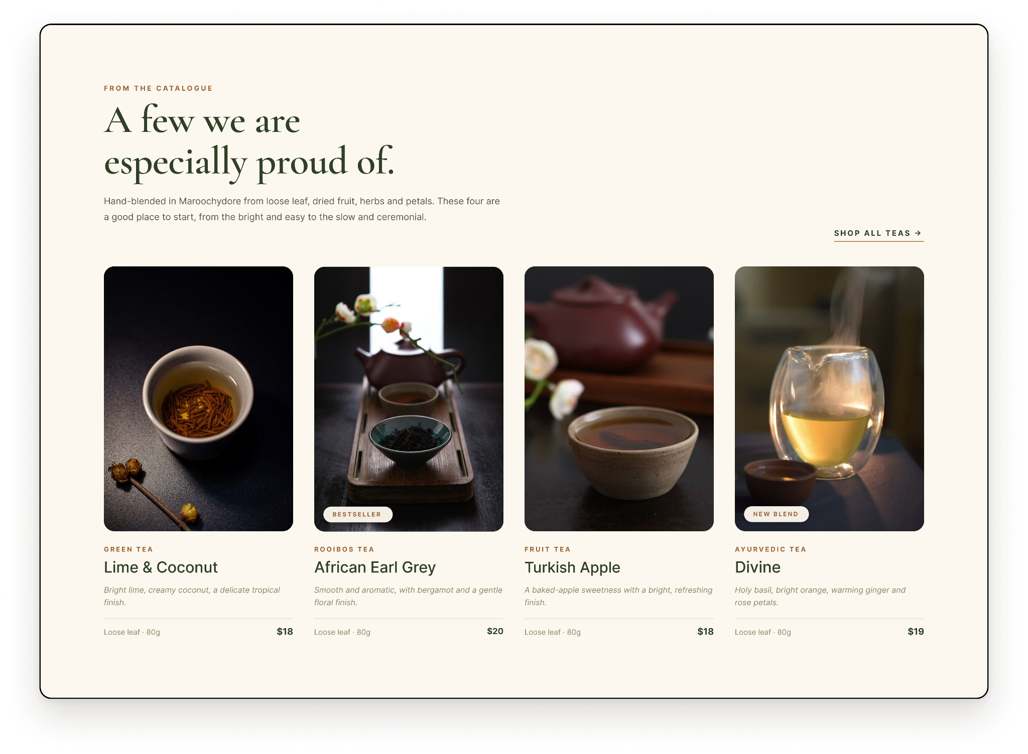
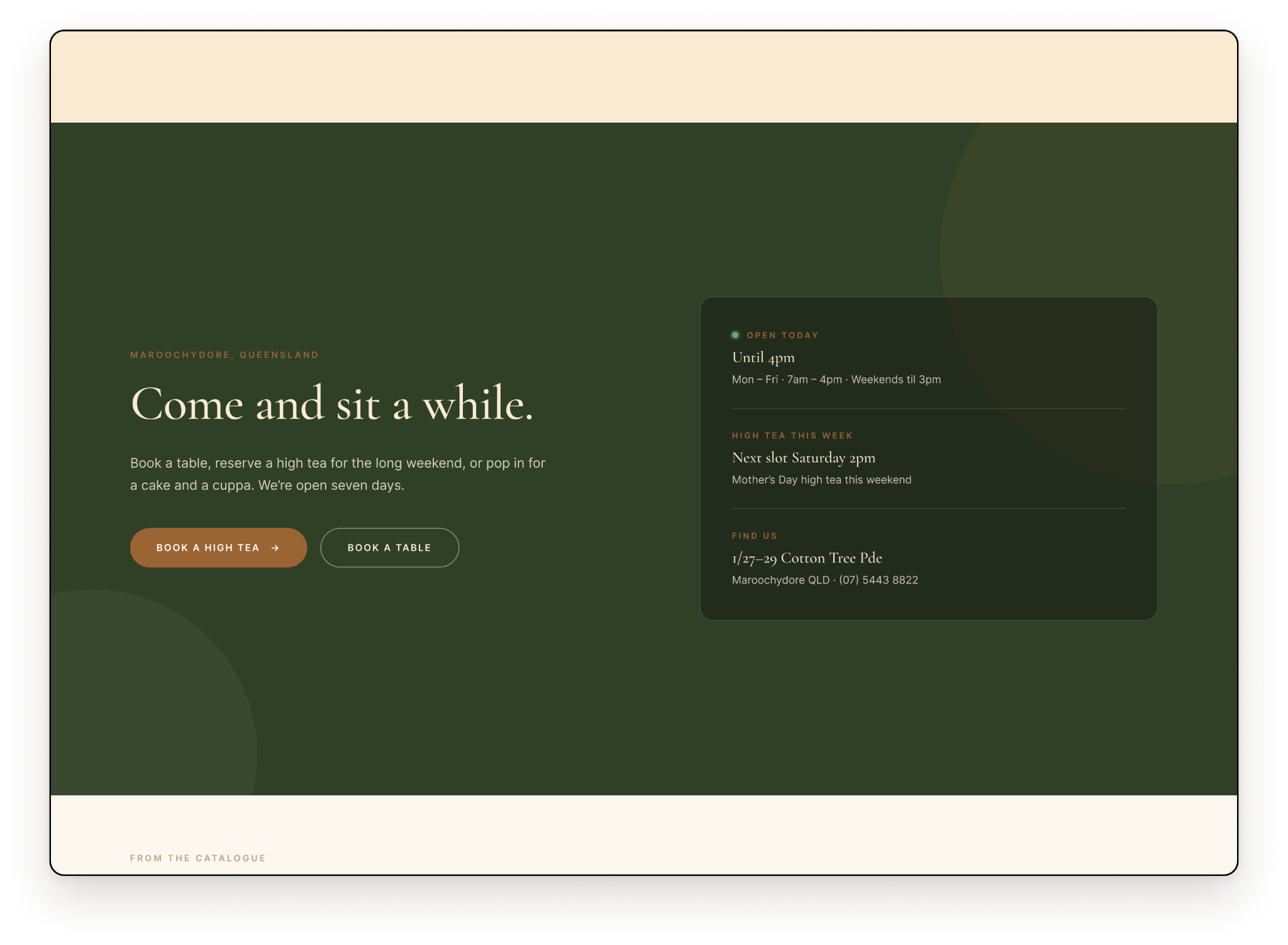
Two of my teammates carried the other MVP pages. As lead I kept them aligned to the shared design language, so the whole site reads as one considered brand.
The High Tea page sells the occasion, then lets people book it. Instant confirmation replaces the old back-and-forth of phone calls and emails.
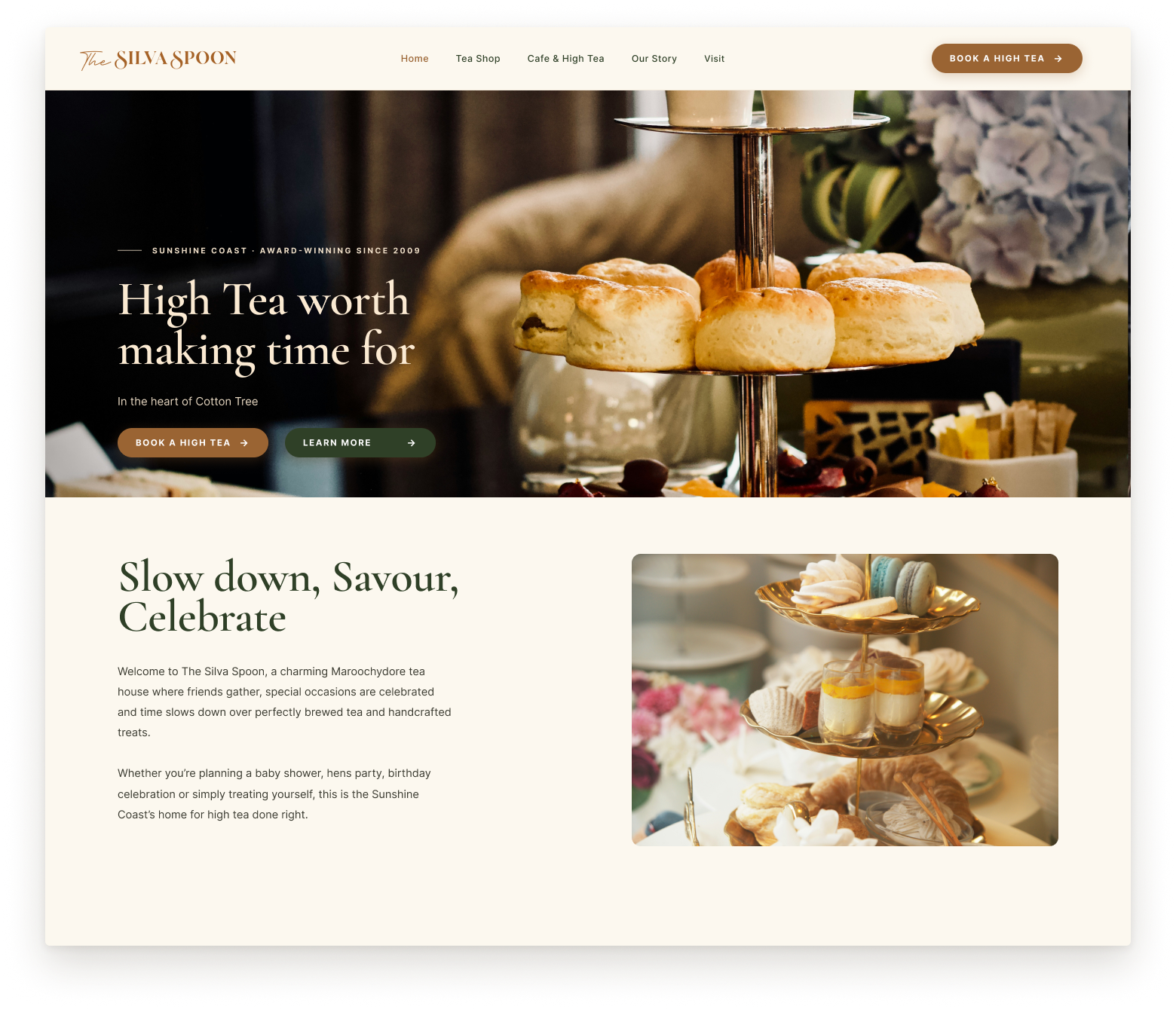
Seventy-eight teas, grouped by type and filterable by name, flavour, or category, with a short quiz for anyone unsure where to start. Curated browsing replaces the old flat product list.
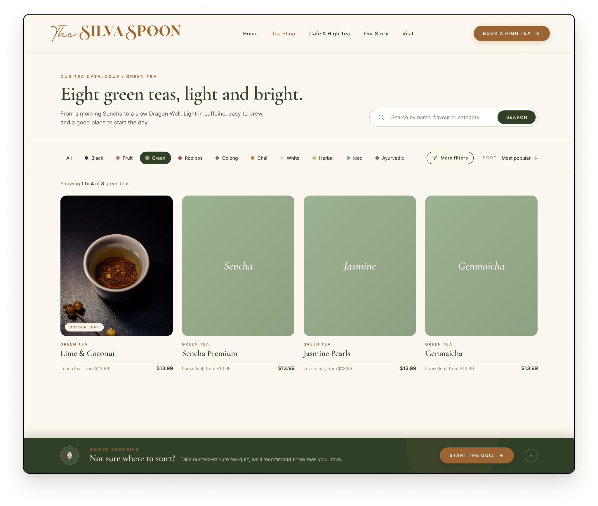
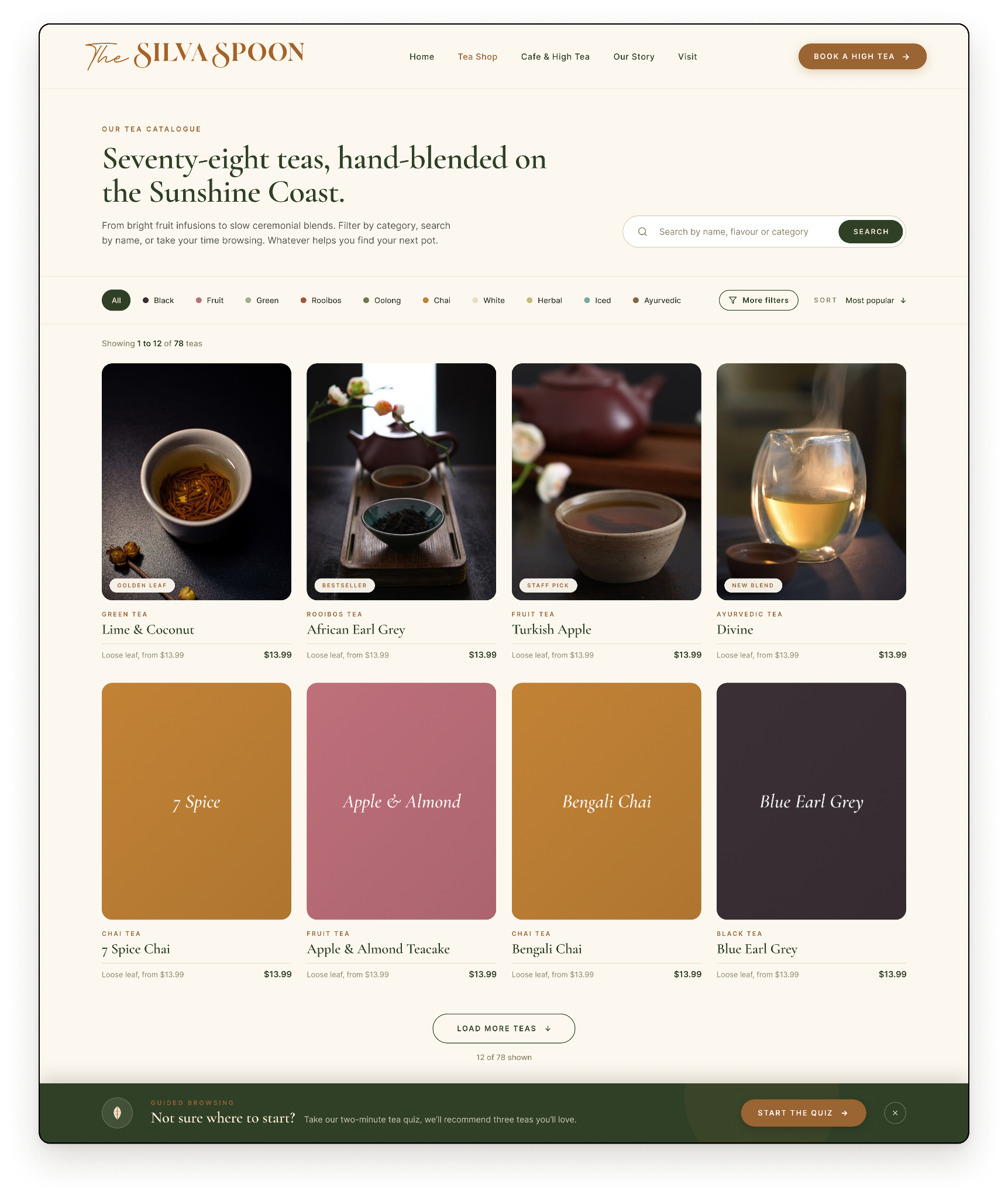
We designed a dual-pathway experience that gives each audience a clear, guided journey from the moment they land: a quick booking system that replaces phone calls and emails, a curated catalogue that replaces the flat product list, and a visual system that bridges both experiences.
The result is a brand that finally feels as considered online as it does in person.
Usability testing with real users
To validate the booking flow, catalogue filtering, and dual-pathway navigation against real behaviour.
A fully responsive mobile site
Ensuring the booking flow, tea catalogue, and navigation all work seamlessly on smaller screens.
Standardise product photography
Replacing current photos with a cohesive, high-quality visual standard, since imagery was the number-one trust signal users identified in our research.
Content strategy and SEO foundation
A tea stylist blog, brewing guides, and seasonal features to drive organic traffic and position The Silva Spoon as an authority.
Build the remaining pages
Cafe menu, cake ordering, and individual product pages with rich detail.
I led a team of three on this redesign, setting direction, keeping our design decisions aligned to a shared language, and owning the homepage end to end. Leading while also designing taught me how much a clear, shared set of principles does the coordinating for you.