Web Platform / UX Case Study
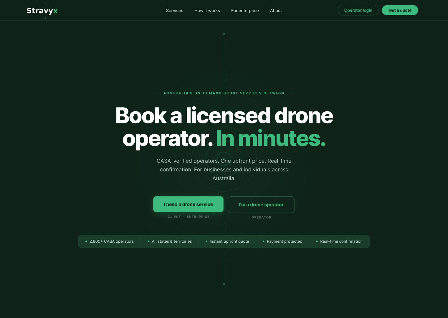
Australia's on-demand drone services network. Book a CASA-licensed operator in minutes, with one upfront price and real-time confirmation.
Role
UX Designer
Duration
Apr – May 2026
Platform
Responsive Web
Tools
Figma, FigJam
Australia has thousands of licensed drone operators, ready to work and impossible to find. Stravyx is the infrastructure layer that connects them to the businesses and people who need them.
Working in a team of four, I helped design the platform end to end: the homepage that serves four different audiences, the mission booking flow, and the operator onboarding journey. The goal was a product that feels like the established national network it wants to become, not a startup still finding its feet.
Stravyx was founded by Joel Gage, who also founded Upskill. The product is still in active development, with no public release date announced yet.
Australia has over 2,800 CASA-licensed drone operators: qualified, ready to work, and invisible. No single platform connects them. Businesses find operators through a Google search, a bit of hope, and a phone call. There are no published rates, no verification, and no real-time dispatch.
It is a $3.2 billion market with no infrastructure layer. That gap is exactly what Stravyx was designed to fill, and every decision we made solves for it.
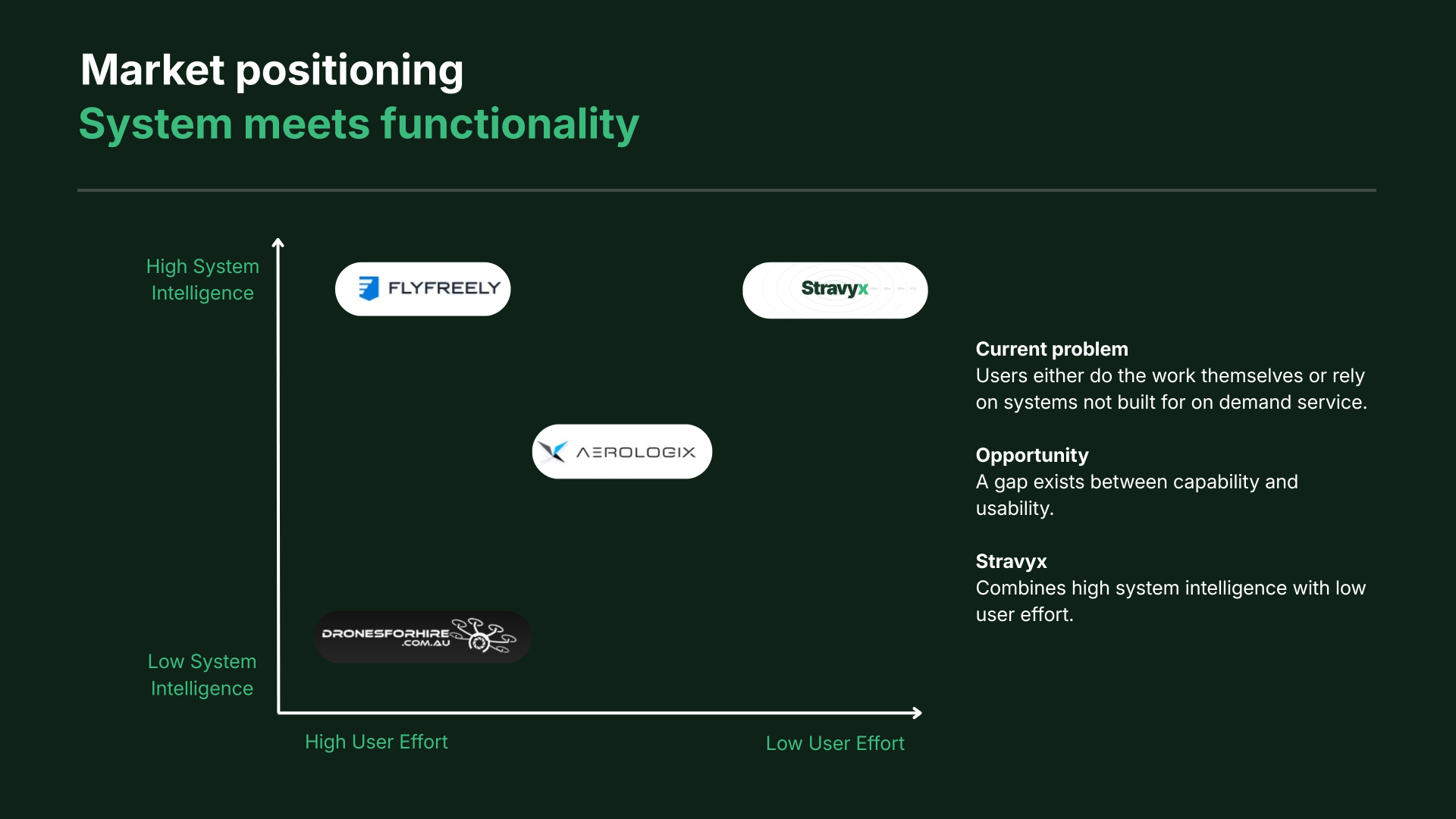
We mapped the market on two axes: how intelligent the system is, and how much effort it leaves to the user. Most competitors are point solutions. They sit at high effort or low intelligence, so users are still doing the coordination themselves or leaning on tools never built for on-demand service.
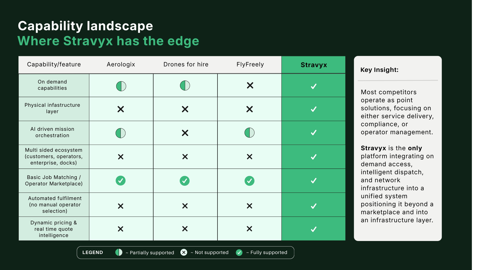
That gap, between capability and usability, is where Stravyx sits: high system intelligence with low user effort. It is the only platform combining job matching, dynamic pricing, automated fulfilment, and an infrastructure layer into one system.
We studied products outside the drone space that had already solved parts of our problem, then adapted what worked.
Uber, for the booking flow
Uber removes decision-making from the user: no manually choosing a driver, the system matches automatically, and tiered pricing gives clear options up front. Stravyx adopts both directly, assigning the best-fit operator and offering four urgency tiers.
Airbnb, for confidence before commitment
Airbnb builds trust by showing what you get before you commit. This pushed us to focus on outcomes over services: you are buying an inspection report or a 3D model, not a drone flight, so the deliverable leads.
Globhe and Canva, for guided entry
Globhe nails the client-versus-operator split but then abandons users on a generic page. Canva shows how different users can land on the same page and each feel it was built for them. Drone services lack that familiarity, so we paired every outcome with a plain-language description.
These findings converged on two design decisions: a two-button hero split (I need a drone service / I'm a drone operator) and outcome-first discovery, where the platform asks what you need rather than who you are.
Three principles anchored every screen we designed.
Inevitability
Stravyx should feel like the category leader that was always going to exist. Not a startup finding its feet, but an established national network.
Clarity
Every user, whether consumer, enterprise, operator, or investor, immediately understands what Stravyx does and where to go, with zero learning curve.
Confidence
Users feel safe handing Stravyx their money, their data, and their professional reputation. Trust is not a feature here. It is the product itself.
Five questions pushed our thinking toward reducing friction and increasing clarity.
Before moving to design, we prioritised six core pages against effort and impact. The high-impact, low-effort work sat clearly in the booking and homepage experience, so that is where we focused.
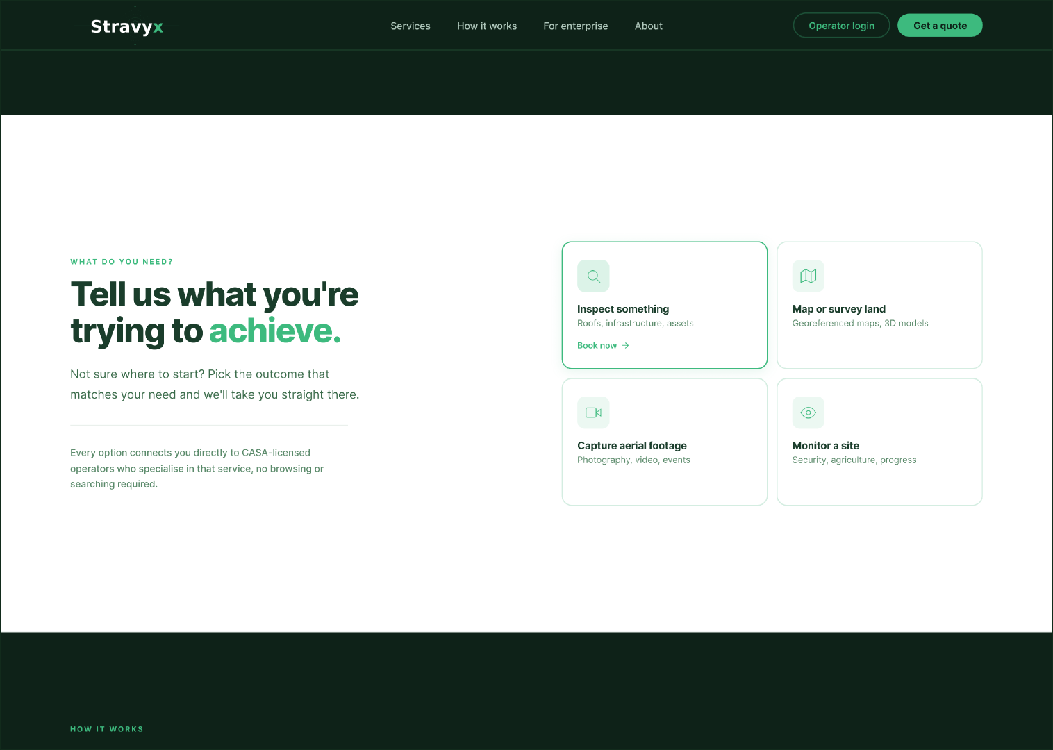
Instead of asking users to browse operators, the platform asks what they are trying to achieve: inspect something, map or survey land, capture aerial footage, or monitor a site. Each outcome connects directly to CASA-licensed operators who specialise in that service. No browsing, no searching.
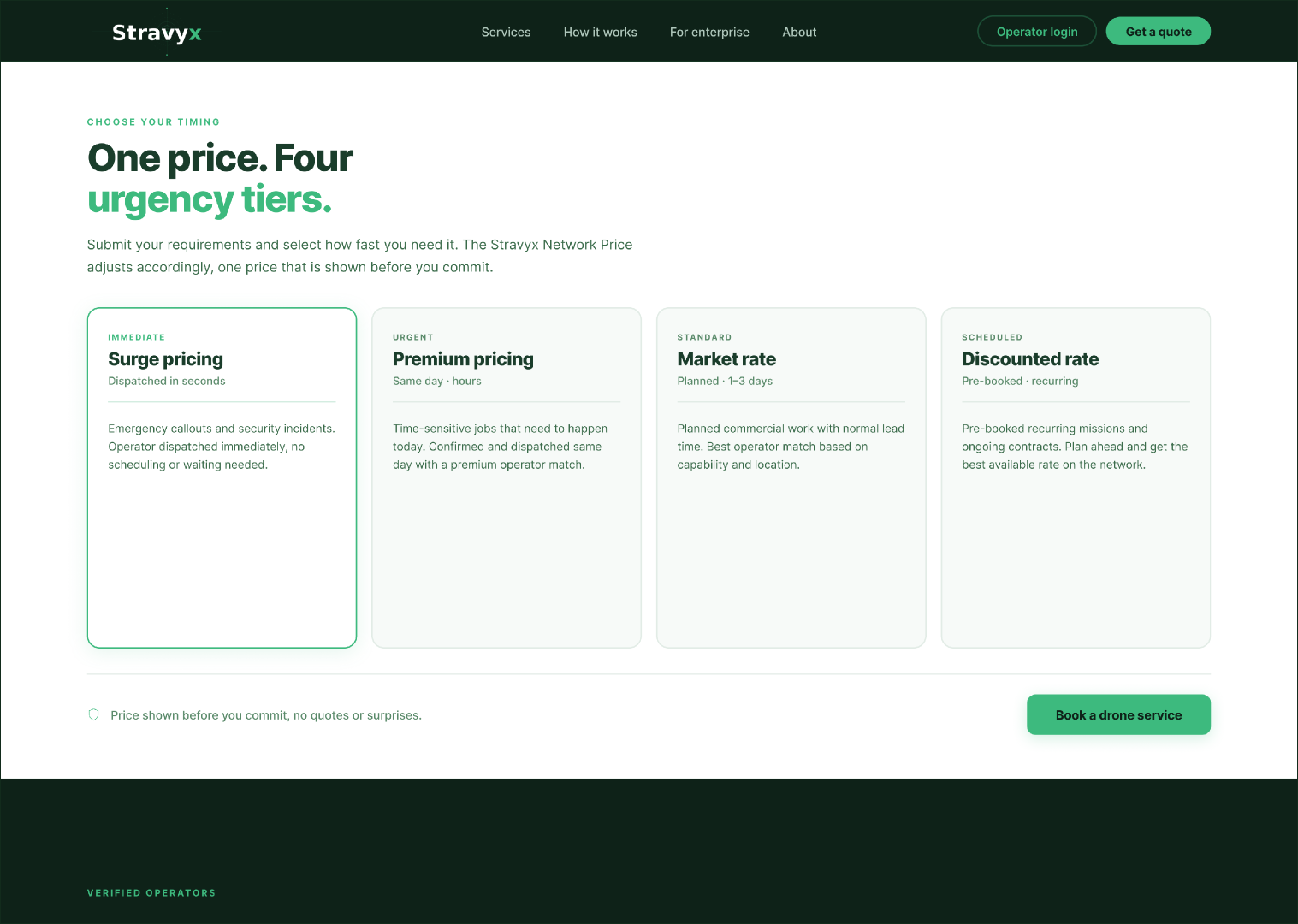
The Stravyx Network Price is generated automatically and shown before you commit. Users choose how fast they need the job done, from surge pricing dispatched in seconds through to a discounted rate for pre-booked recurring work. One price you accept or decline. No quotes, no surprises.
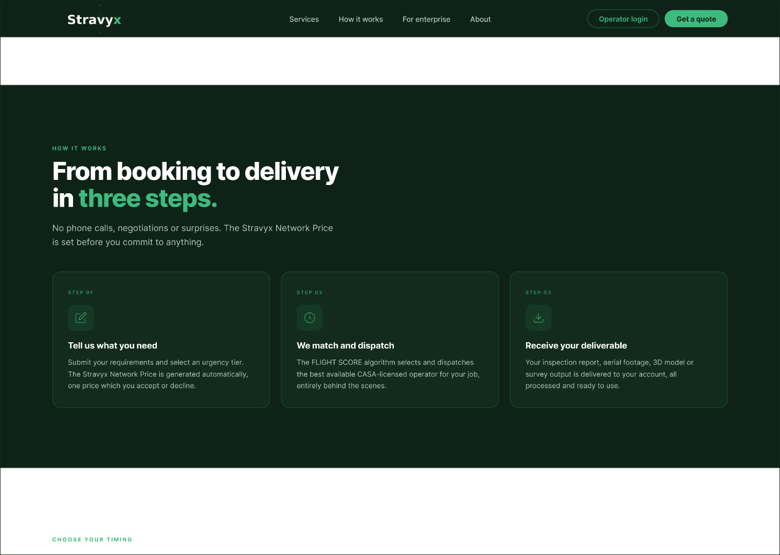
Tell us what you need, we match and dispatch the best available operator behind the scenes, and your deliverable arrives ready to use. The FLIGHT SCORE algorithm handles operator selection so the user never has to.
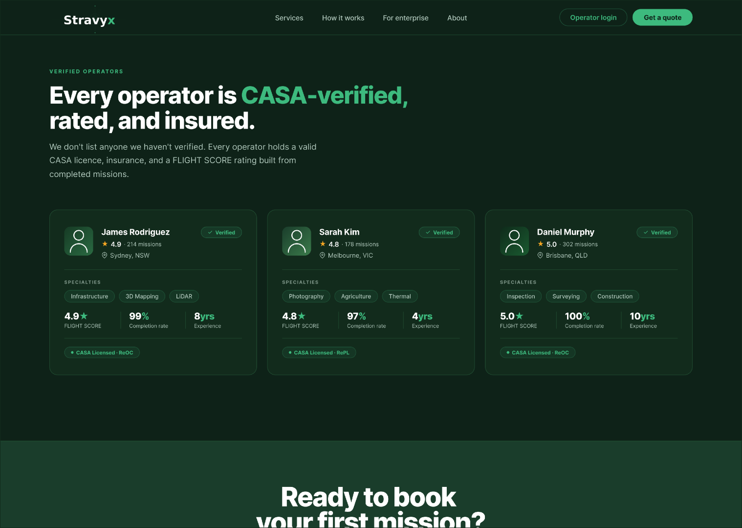
Every operator holds a valid CASA licence, insurance, and a FLIGHT SCORE rating built from completed missions. Surfacing operator history, completion rates, and specialties turns trust into something visible and measurable.
Stravyx had to look like the infrastructure layer for a multi-billion-dollar market, not a passion project. Six words anchored the identity: trusted, precise, Australian, capable, accessible, grounded. A deep forest green carries authority, with mint reserved for every call to action and trust signal, so the interface is always signposting where to act. Type is set in Inter for clean readability at every size.
Four principles guided the design direction:
Validate designs against survey results
All screens need to be tested against survey responses once received, to confirm direction and surface anything that needs refinement.
Mobile-first build
Everything was designed desktop-first. A mobile version of the homepage and booking flow is critical, because the target audience books on the go.
Post-mission deliverable experience
The moment a client receives their report or footage is high value and has not been designed yet. Getting this right closes the full client journey.
Enterprise accounts
Enterprise clients managing multiple sites will need bulk booking, reporting, and account management tools. Building toward this early makes scaling easier.
Operator rating and reputation system
The FLIGHT SCORE is a strong differentiator but currently invisible. Surfacing operator history and success rates would increase both trust and conversion.
Stravyx was a team project with four designers. I contributed across research, the how-might-we framing, MVP prioritisation, and the high-fidelity design of core pages including the homepage and booking flow. Working within a shared design language taught me how to keep a single, coherent voice across many hands.