Most software treats users as operators of a machine: here are the inputs, here are the buttons, figure out how to get what you need. Bret Victor's 2006 essay "Magic Ink" argues for a different approach. What he calls information software is designed like a well-made publication. Users come with questions. The software presents relevant information so clearly that the answers are obvious at a glance.
Which brings me to Westpac's "Make a Payment" page. What should be a simple transaction requires more thinking than the task deserves. This is one user's experience, and I'd want to validate these observations with broader research. But the friction points are worth examining.
Victor's framework helps explain why.
The Identity Crisis
Victor talks about software having an identity crisis. Designers build it without really understanding what it's for. Westpac's payment page is a perfect example. It dumps everything on you at once: tabs, dropdowns, text fields, radio buttons. There's no clear starting point. No visual hierarchy guiding you through. You came here to pay someone, but first you need to decode the interface.
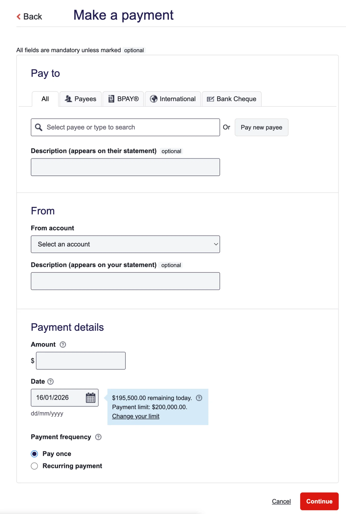
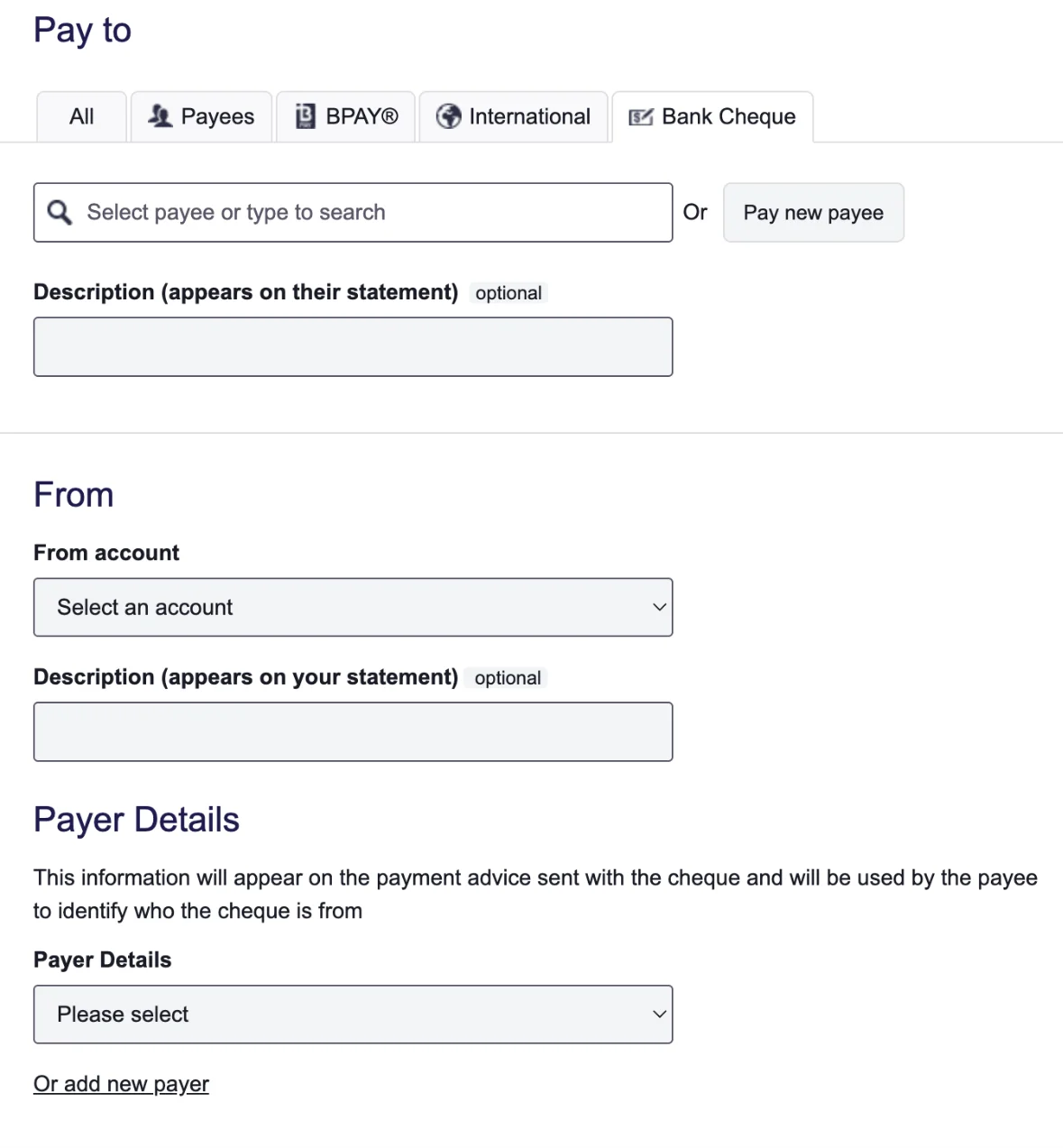
Look at the Bank Cheque section. There's a field labelled "Payer Details" with this explanation underneath: "This information will appear on the payment advice sent with the cheque and will be used by the payee to identify who the cheque is from."
That's 23 words to explain something a simple label and icon could handle. Instead of showing you what to do, the page makes you read instructions. Victor would call this manipulation-software thinking. The designers are worried about database fields instead of human understanding. While some of these constraints are possibly regulatory or legacy-driven, the resulting experience still places excessive cognitive load on the user.
Context-Sensitivity Failure
Here's where Victor gets really interesting. He says software can pull context from three places: the environment, your history, and direct interaction. And critically, interaction should be the last resort. Good software figures out what you need before you have to ask.
Westpac's page does the opposite. It demands you interact immediately while ignoring everything it already knows about you.
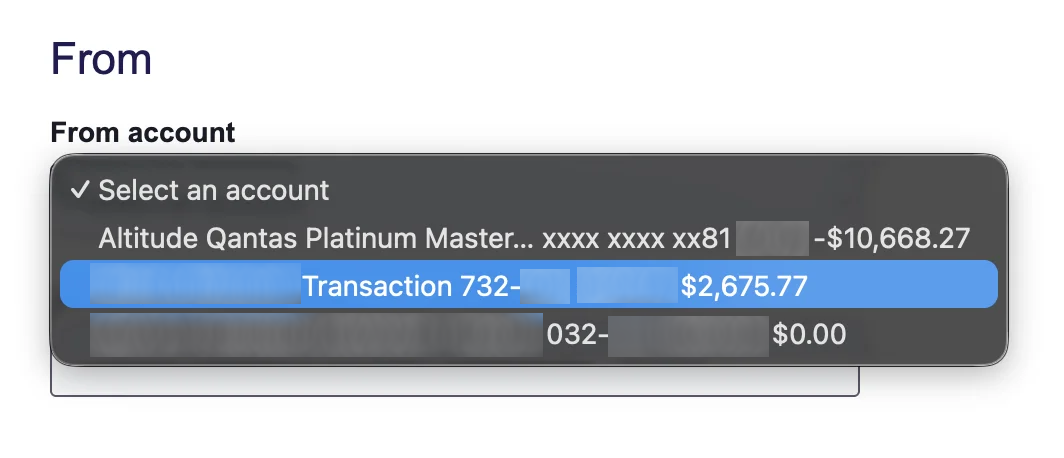
Think about it. The software knows your account balances. It knows who you've paid before. It knows your recent transactions. But when you go to select which account to pay from, all that useful information gets crammed into a tiny dropdown. The balance, arguably the most important thing, sits at the end, fighting for space with BSB numbers and account types. Why isn't it front and centre?
Then there's the "All" and "Payees" tabs. They show essentially the same content. If there's no meaningful difference, what's the point? The software isn't filtering based on your behaviour or predicting what you need. It's just exposing its internal structure and hoping you'll figure it out.
Most frustrating of all, if you don't have enough money in the account you selected, there's no graceful recovery. You can't quickly shuffle funds from another account. You have to bail out of the whole process, transfer money separately, and start again. The page can't adapt because it was never built to understand your situation.
Navigation That Wastes Your Time
Alan Cooper, who Victor references, has this great concept called "excise." It's the effort the tool demands that doesn't actually help you reach your goal. Westpac's page is full of it.
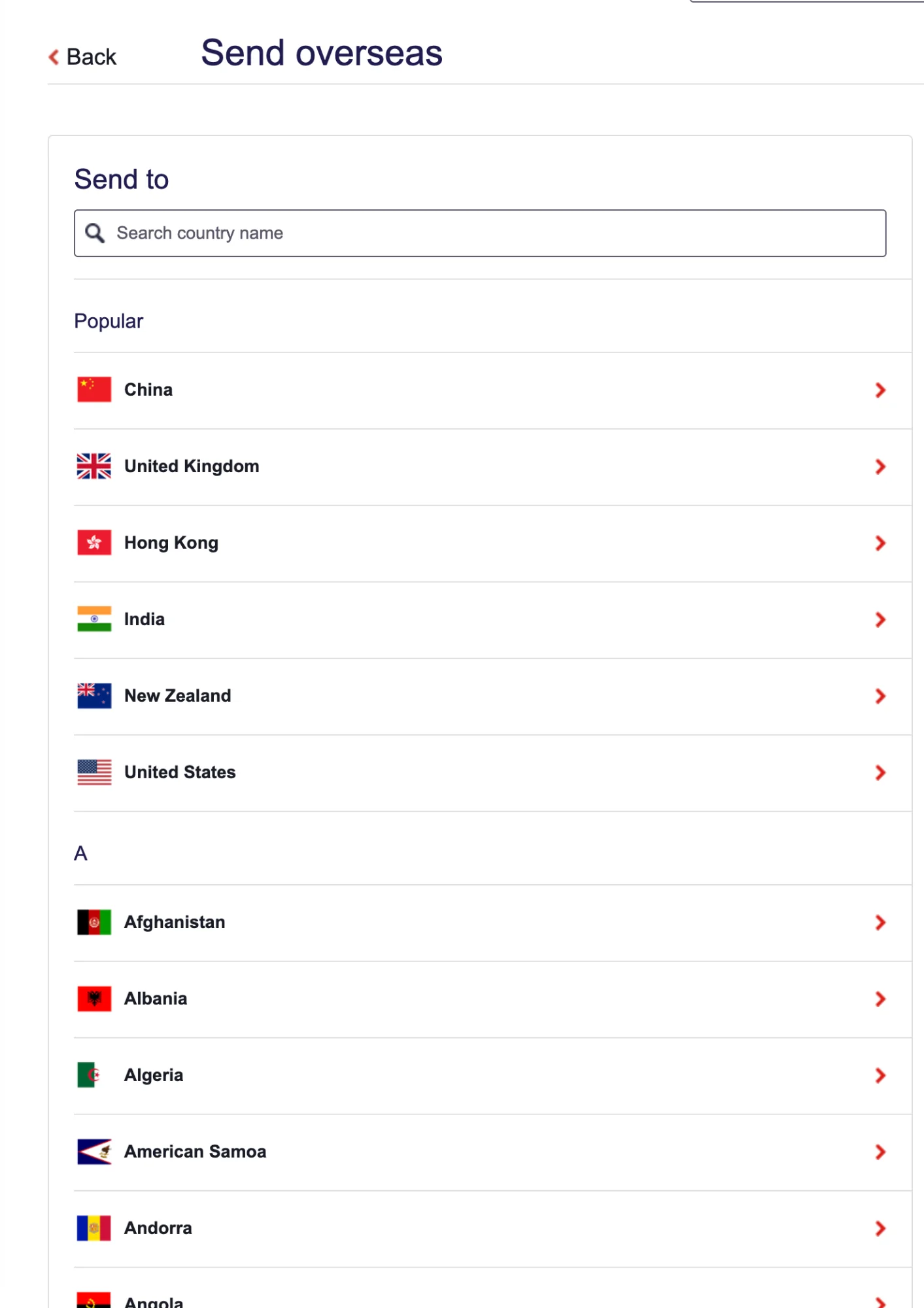
Those tabs at the top (All, Payees, BPAY, International, Bank Cheque) look like they'll filter the content below. But "International" and "Bank Cheque" redirect you to completely different pages. Meanwhile, "Payees" and "BPAY" stay on the same page but add a tiny note about processing times under the date field. The inconsistency is disorienting. You can't build a mental model of how this thing works.
The "Pay new payee" button is another headache. It sounds like it'll help you make a payment to someone new. But it doesn't. It just adds someone to your address book. The label hides what the action actually does.
Even the description fields add friction. There are two of them: one for your statement, one for the recipient's. Most of the time, you want the same thing on both. Why not make that the default and let people opt out if they need something different?
Show the Data, Not the Database
Tufte's first rule of information design, which Victor hammers home, is dead simple: show the data. Give people enough information to make decisions at a glance.
This page shows you the shape of a database instead. Fields to fill. Parameters to set. What it doesn't show you clearly: your actual balances, your recent payees, when the money will arrive, processing cut-offs. There's plenty of white space, but it doesn't help you understand anything. It just separates things without showing how they relate.
Victor's point is sharp: design this like an information graphic, not a form.
What Could Be Better
So what would a Magic Ink-inspired version look like?
Start with the obvious question: Who are you paying? Show recent payees right up front. The software already has that history. Let the payment type emerge from who you select rather than forcing you to pick it first. Display the account balance the moment you choose where to pay from. And if there's not enough money? Give people a way to fix it without abandoning everything.
Victor's core insight still holds up: print had to show everything because ink is permanent. Software doesn't have that excuse. It can infer, filter, and show only what matters. Westpac's payment page, despite living in the age of dynamic interfaces, still acts like a paper form from 1995.
It asks users to do the thinking that software should handle invisibly.